Summary
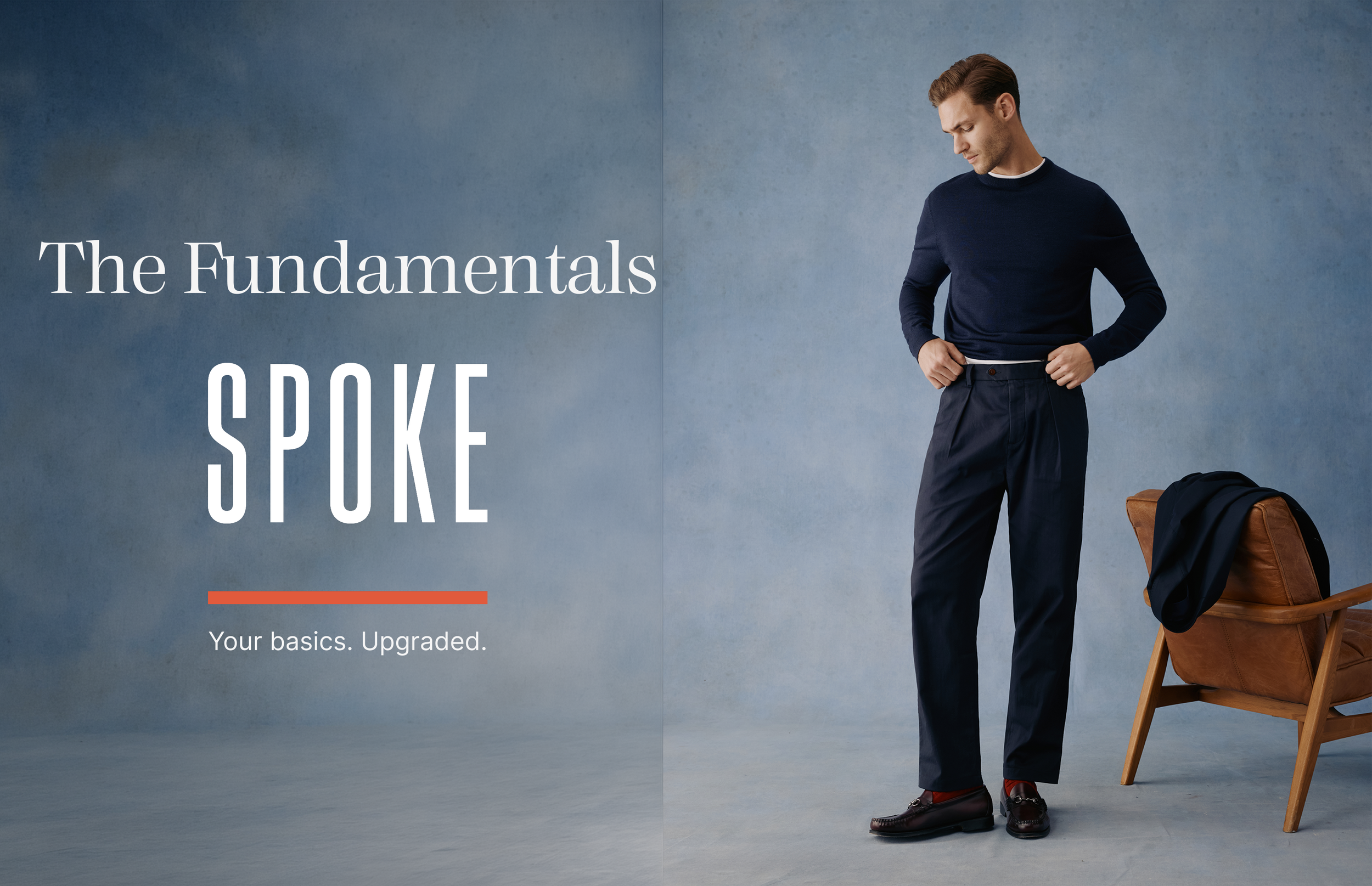
Context & Problem: Designed a 360° digital campaign for Spoke London, a direct-to-consumer menswear brand built around fit, to launch its Fundamentals basics collection. The core problem: basics are usually a low-engagement purchase, yet Spoke's whole value is fit, so the campaign had to make basics feel worth caring about across five very different touch points.
Role & Process: Led the brief end to end as a Digital Designer task. Interpreted the brief, developed the campaign concept "Built for Repeat," mapped each touchpoint to a distinct funnel role, and built everything in Figma on Spoke's own brand library. Scaffolded the build with Claude Code connected to Figma through the Figma MCP server, then refined the frames by hand into working interactive prototypes.
Outcome & Impact: Delivered five launch-ready assets with a clickable prototype, presented as a 12-frame walkthrough. The work reached the final stage of the process and in review the interactive prototypes and depth of UX thinking were singled out as clear stand out features.
Context
Context: A 360° digital campaign rollout for a direct-to-consumer menswear brand built around solving fit through a proprietary sizing system, for the launch of its collection.
Goal: Carry one idea, "your basics don't have to be basic," across five digital touch points, each doing a distinct job from first awareness to purchase, while keeping the whole campaign unmistakably one thing.
Tools: Figma, Claude Code with the Figma MCP server, interactive prototyping.

Problem
Basics are typically a low-engagement, grab-and-go purchase. The company’s entire proposition is that the fit makes them worth caring about, so the campaign had to make "basics" feel considered, not commodity.
A 360° campaign breaks down when the assets are designed in isolation. Five touch points can easily become five disconnected designs that share a logo but not an idea.
Editorial imagery sells the mood but tends to hide the product, creating friction between brand storytelling and commercial conversion.
This wasn't a single-asset design problem. It was a system problem: one idea that had to hold its shape across five very different contexts.


The “A-HA”
Moment
The unlock was shoppability inside the storytelling.
Editorial imagery usually sells the look but hides the product. By placing small plus icons on each garment in the lookbook shots, with a hover popup showing name, colour and price that links straight to the product page, the editorial moments became the conversion moments. Story and selling stopped competing with each other.
That was also where the campaign idea, "Built for Repeat," landed as the through-line. Once each touchpoint was mapped to a distinct funnel role rather than treated as a separate design, the work shifted from "make five nice assets" to "build one system that performs in five contexts."

A Key Challenge
The main challenge wasn't designing screens. It was holding one idea steady across five formats while balancing editorial brand-building against commercial clarity.
Some constraints included:
Brand assets were provided, but no lifestyle photography.
A tight deadline against five separate deliverables.
Five formats that had to feel distinct yet unmistakably part of the same campaign.
A live brand to design against, with its own established tone of voice to honour.
The tension was sharpest between the organic and paid social, where the same content has to do two different jobs. A narrow fix on any single asset would not have held the campaign together, so the solution had to be systemic.
Solution, Output & Impact
Resolution:
I designed the campaign as one system expressed five ways:
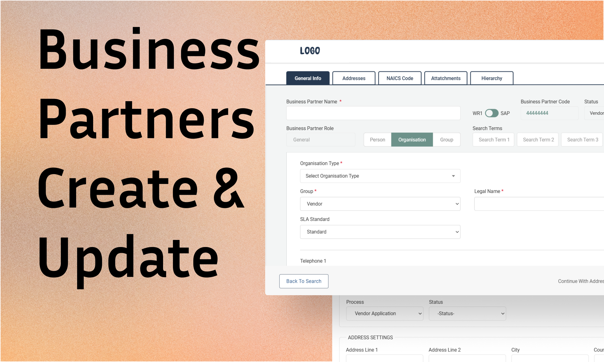
Mapped each touchpoint to a funnel role: homepage takeover captures, landing page converts, email re-engages, organic social builds community, paid social drives acquisition.
Built shoppable editorial, with hover-to-shop plus icons linking straight to product, so storytelling and selling reinforced each other.
Kept one shared visual system, the Get the Look carousel, across organic and paid, shifting only the intent: organic leads with story, paid leads with commercial clarity and native product tagging.
Scaffolded the build using Claude Code connected to Figma via the Figma MCP server, reading the existing brand components, colours and nav directly from the file (get_design_context), generating frames in place, then refining by hand into interactive prototypes.
Presented the work as a 12-frame Figma walkthrough carrying the design rationale, a comparison against Spoke's live site (richer landing-page interactivity, a dual-CTA homepage, more explicit shoppability throughout), and a reflection on next steps.
Impact:
The work reached the final stage of the process.
The interactive prototypes were singled out as a clear differentiator in feedback, since most candidates show static screens.
UX depth was flagged as a standout against other candidates.
A portfolio piece that bridges B2B SaaS experience into consumer and brand work, built with a current, AI-assisted design workflow.
This wasn't a set of campaign mockups. It was a working, end-to-end system, built with a modern design-to-Figma pipeline, that proved consumer-facing capability sitting on top of a UX foundation.
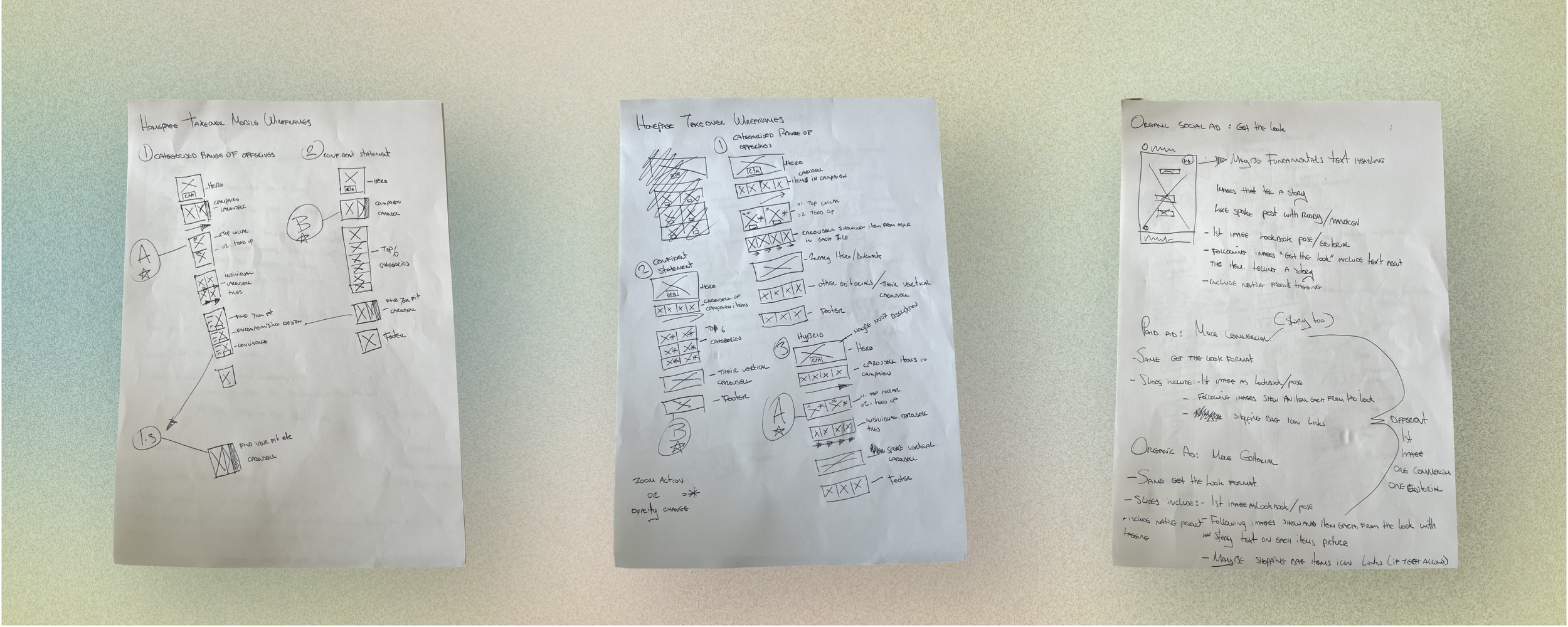
Paper Wireframes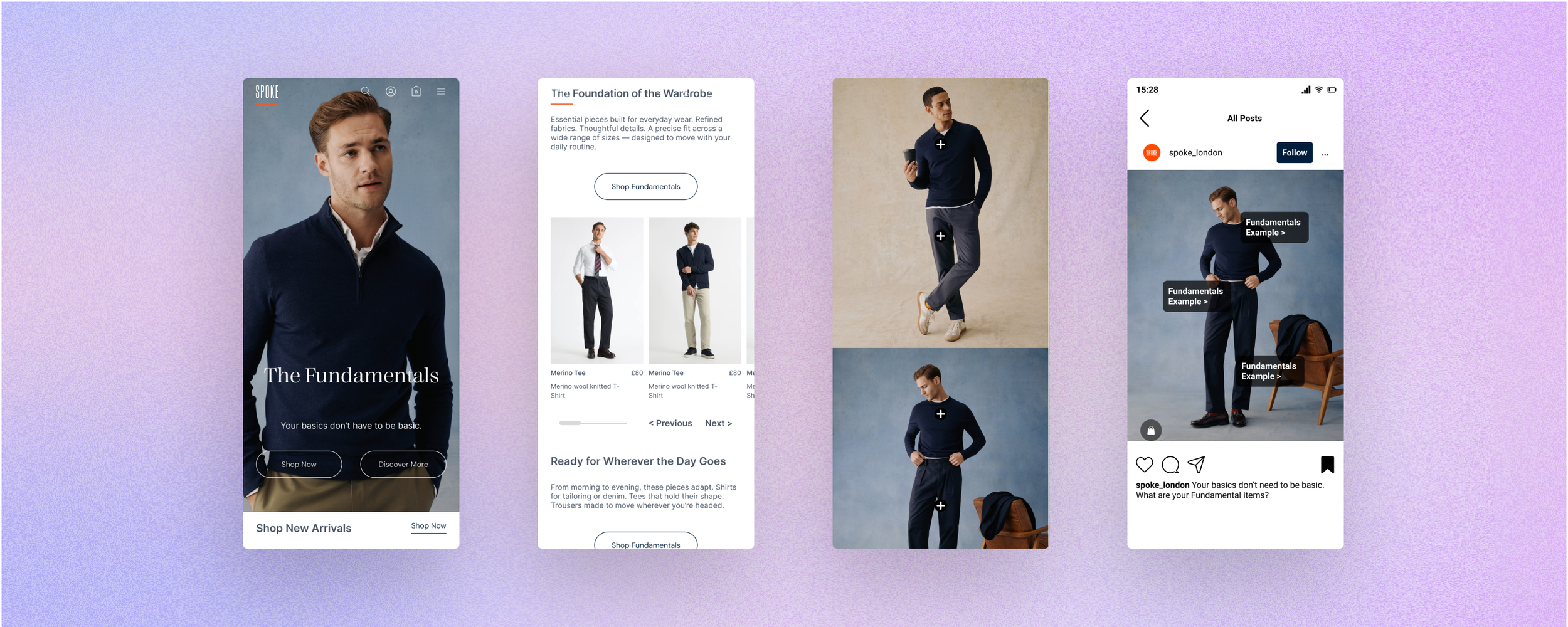
High Fidelity Mobile Prototypes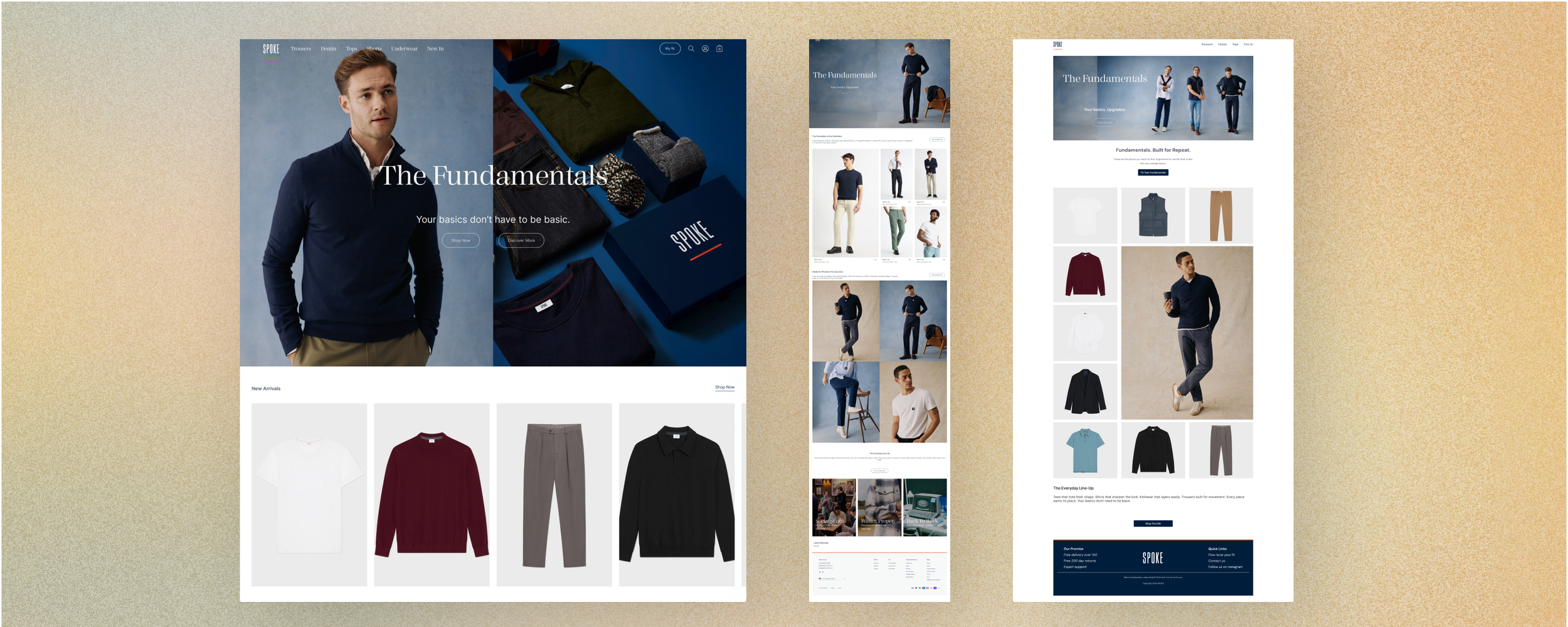
High Fidelity Desktop PrototypesOther Case Studies