

Summary
Problem & Context: Formed a solution to a fragmented, spreadsheet-based asset tracking system for internal teams by designing a unified, trustworthy system that reduced manual input and data chaos.
Role & Process: Led UX research, interviews, ideation, and iterative prototyping, focusing on simplicity, clarity and adoption. End-to-end design.
Solution & Impact: Delivered a scalable, user-centred asset registry system with search/filters, lifecycle metadata, reports, and responsiveness. This reduced time spent logging asset data by 70% and rapidly increased adoption rate.
The Context
Customer / Stakeholder: Internal operations teams and Project Managers at my employer ISB Global LTD, a medium-to-large organisation. ISB Global needed a way to track physical and digital assets (hardware, licenses, furniture, consumables, etc.) across multiple locations.
The project focused on designing a secure, multi-tenant login component for an IT Assets Register application. The design challenge was to create a solution that catered to diverse organisational requirements while ensuring robust security, scalability, and seamless user experience.
Problem: Asset inventories were siloed. Existing methods were chaotic as they were displayed in spreadsheets, fragmented databases, or paper logs. Data duplication, lost items, inconsistent records, difficult audit trails and no unified view for managers became themes for this way of inventory tracking. Users spent hours manually reconciling data and asset requests were often lost.



Insight
Through a mixture of interviews and observation with operational staff & managers, I discovered that:
The core frustration wasn’t just losing assets but also lack of trust in data. Managers often doubted that the spreadsheets reflected reality, resulting in regular double checking.
Users expressed thoughts of the current spreadsheet system as being “outdated” and “chaotic”.
Users cared about simplicity: easy lookup, quick updates, history logs, and clear statuses. They didn’t need over-engineered tools.
the “A-ha”
Moment
Suddenly it dawned on me, that even a great system would fail if it didn’t feel immediately reliable, clear and simple for frontline users. We needed a system of truth. This led to thinking instead of forcing these rigid workflows, lets build a scalable, asset registry platform where each asset has a profile & history. Once that clicked, the project direction changed from “make the table look better” to “create a single source of truth that people could rely on”.
This meant taking the spreadsheet mentality and transforming it into a structured CRUD lifecycle UI, with emphasis on clarity and minimal cognitive overload.

Key Challenges
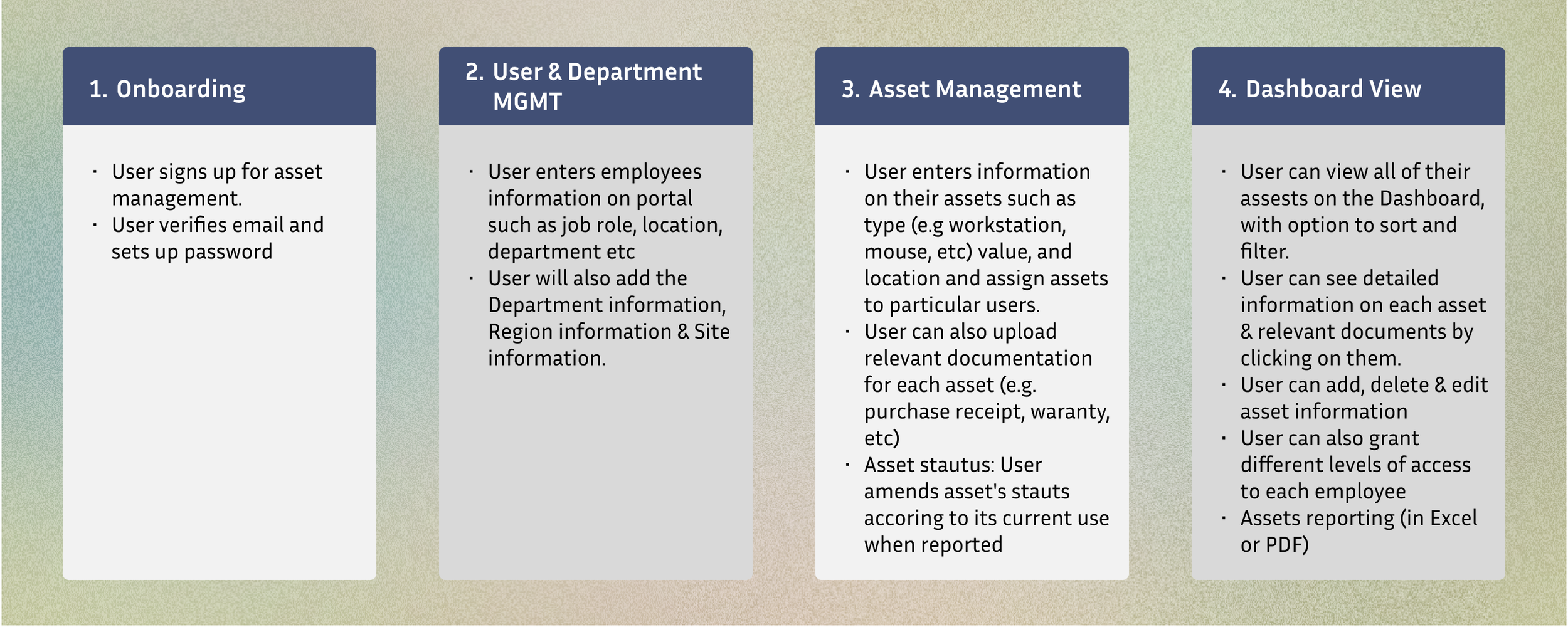
Changing platforms: Data migration from legacy spreadsheets and multiple sources with inconsistent formats.
Data complexity: There were a wide range of asset types (hardware, consumables, licenses), and each required different metadata (serial numbers, location, assignments, expiry, license counts). Designing a flexible yet simple data model was tricky, especially when aiming to achieve scalability for future assets to be included in the future.
User adoption: Team members were somewhat comfortable with spreadsheets as it was familiar, even though it was highly error prone. To reduce the risk of resistance to a new system the UI/UX had to feel approachable.
Audit & reporting needs: Managers required advanced functionality like exportable reports, history logs and audit trails with usability for non-technical staff.
The UX problem was not to design an organised table; it was to make the complex appear simple.

Solution, Output & Impact
What I built:
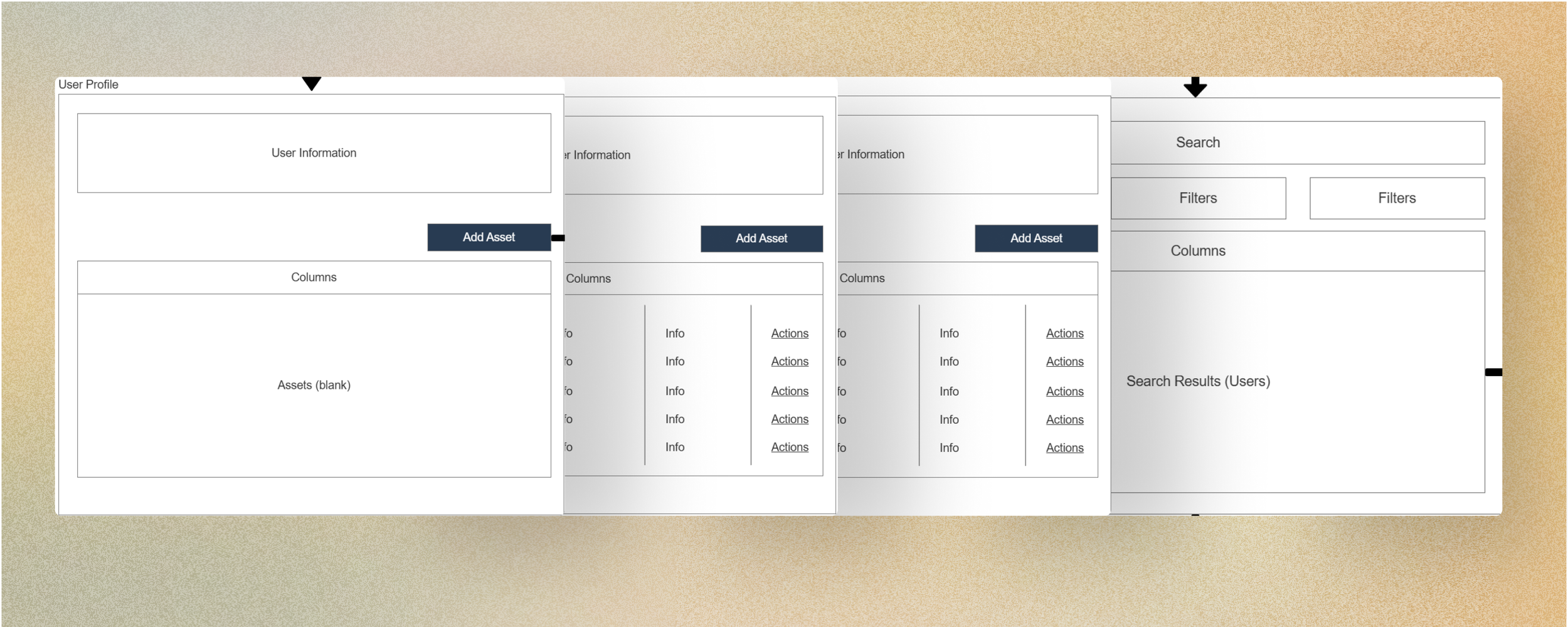
A clean, user-centred, scalable design with a unified asset list, filters & search, with ability to sort by type, location, status, or assigned user.
Asset detail pages with metadata, assignment history & life-cycle status.
Exportable reports & audit logs: CSV/Excel export, history logs per asset, and summary reports for managers.
Responsive design: desktop & tablet for general use, with minimal mobile-friendly design for quick checks or asset review on the go.
Usability testing (remote & in-office) & iterative prototyping with agile methodologies until time of hand off.
Impact / Results (where measurable):
Reduced time spent logging asset data by 70%.
Eliminated asset “loss incidents” tied to missing records (over first 3 months).
High user adoption: within a month, 95% of asset changes and requests went through the new system.
Managers reported increased confidence in data and compliance which improved integrated seamlessly with existing systems, reducing setup and maintenance overhead.
Delivered a scalable solution capable of supporting multiple tenants with varying user roles and permissions.
This allowed me to deliver a product experience that reduced operational risk and made daily work significantly easier to manage. The solution moved the platform away from scattered spreadsheets and towards a trusted, auditable, central source of truth.

Other Case Studies & INFO