Summary
Context & Problem: Designed a clean, intuitive mobile-first shopping experience for a minimalist streetwear, homeware, audio tech & art marketplace to solve cluttered interfaces and confusing navigation in existing e-commerce apps.
Role & Process: Led full end-to-end UX design from competitive analysis and personas through low/high-fidelity wireframes and usability testing, simplifying navigation, icons and visual hierarchy for reduction of cognitive load.
Outcome & Impact: Delivered a minimalist, high-usability interface that drove a 25% reduction in tap errors and 68% faster task completion, with clearer navigation and smoother shopping flows.
Context
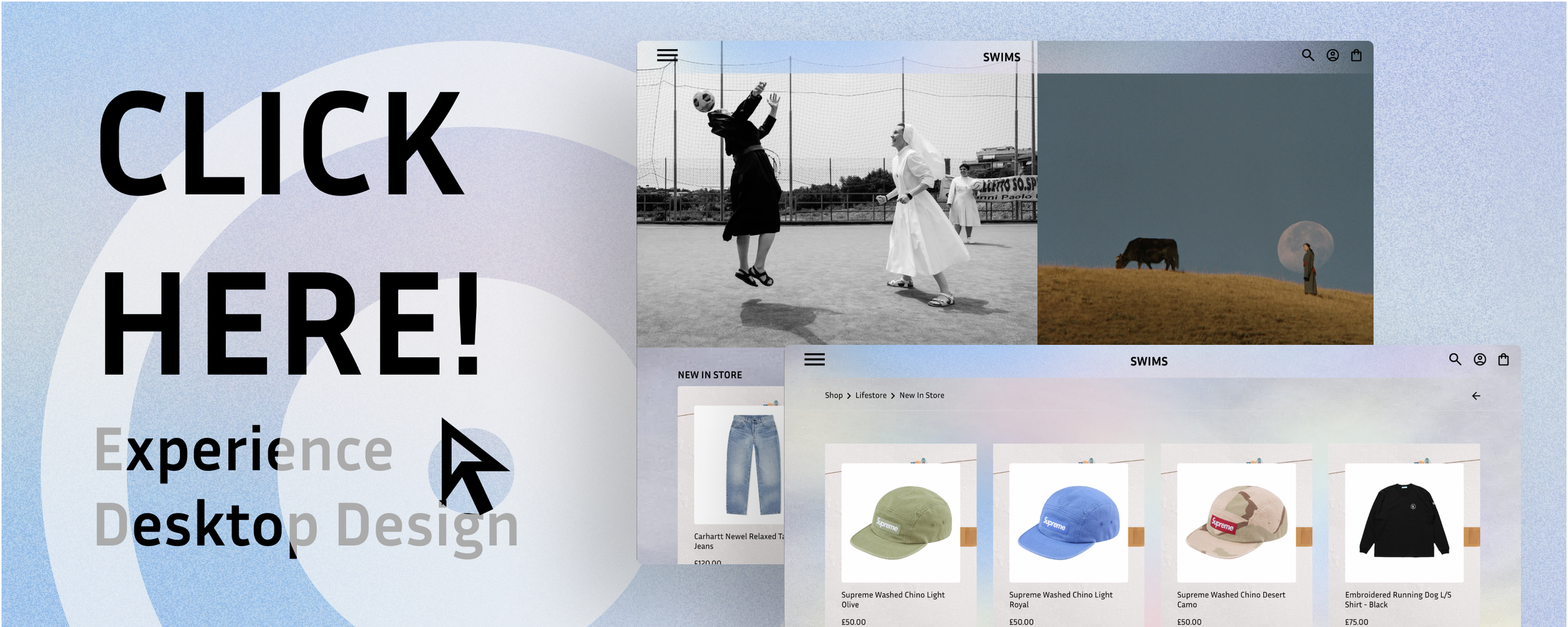
Context: Responsive, mobile-first, shopping design for a streetwear, homeware, audio tech & art marketplace.
Goal: Design a clean, intuitive minimalist mobile experience that reflects the aesthetic preferences of trend-driven shoppers while improving usability and conversion.
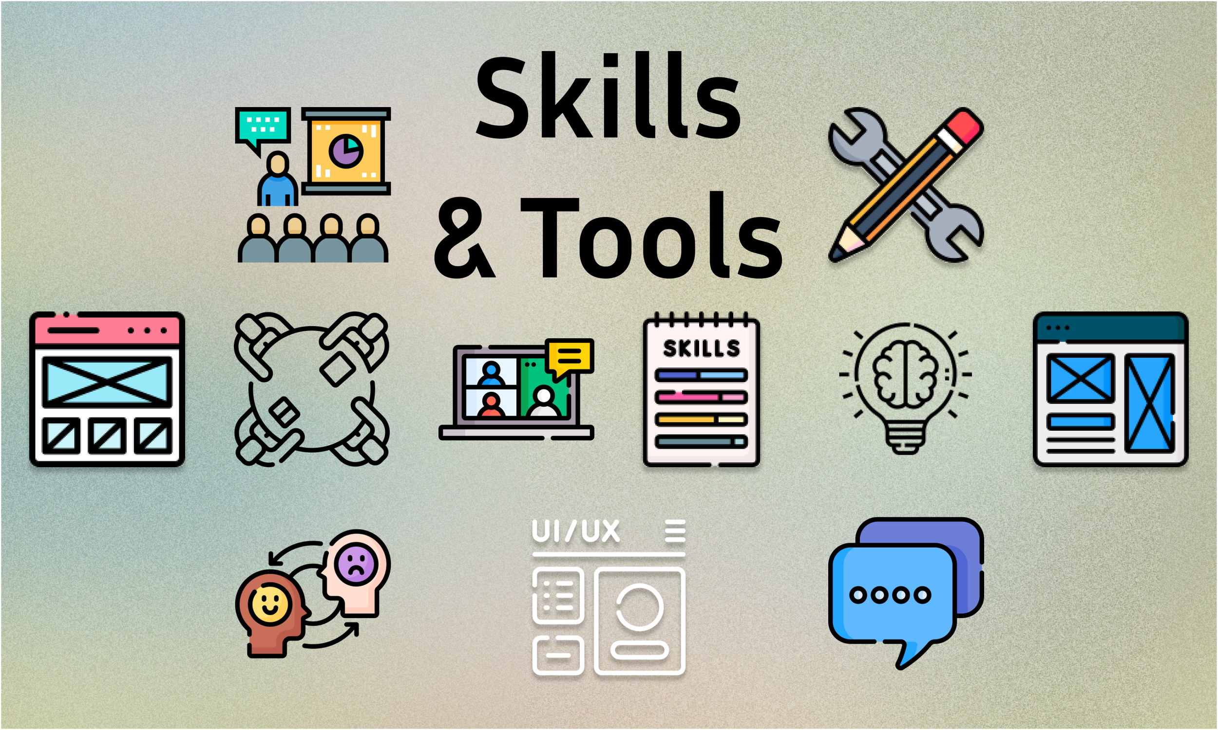
Tools: Figma, Photoshop, user surveys, usability testing

Problem
After completing a competitive UX analysis, users typically struggled with cluttered interfaces and inconsistent navigation in existing shopping apps.
For this project, the challenge was to build an engaging, minimalist design on both mobile & desktop that boosts conversion and aligns with the aesthetic expectations of the target audience (fashion & lifestyle product buyers).
Through usability testing, users reported issues with interacting with buttons and found choice of icons confusing.
This wasn’t just a UI aesthetic issue. This was a breakdown in how users understood and interacted with the system.

The “A-HA”
Moment
The major realisation was that small touch targets and information architecture problems had a big impact on success metrics.
One insight stood out. Users weren’t slow because the UI looked complex. They were slow because navigation and structure didn’t reflect how they actually think.
Once navigation was grounded in user language and behaviour, not assumption, the solution shifted from “polish this screen” to: design flows for optimum confidence and predictability.

A Key Challenge
The main challenge wasn’t designing screens. The main challenge was designing a mental model; a product that matches users' existing beliefs about how things work.
Some constraints included:
A diverse product range (streetwear, tech, art, homeware).
Limited real-world behavioural data for this specific user base.
Mobile-first requirement with screens and interactions that scale down without losing clarity.
High business priority on conversion, not just usability.
Because the problem affected navigation, discovery, and first-time user success, a narrow UI fix would not be sufficient. We had to iterate flows.
Solution, Output & Impact
Resolution:
I redesigned the key interaction patterns to:
Simplify navigation hierarchy
Use clear, tested iconography
Increase tap target sizes
Match category language to user mental models
Iterate flows in rapid prototypes
Validate improvements with usability testing
These changes created a more predictable, confident browsing experience, especially on mobile.
Impact:
After implementation and validation:
25% reduction in tap errors
68% faster task completion times
Clarity in navigation that matched user expectations
This wasn’t just UI refinement. It was alignment of structure with user behaviour. Users weren’t just quicker, they were more confident in every touchpoint.

Paper Wireframes
High Fidelity Mobile Prototypes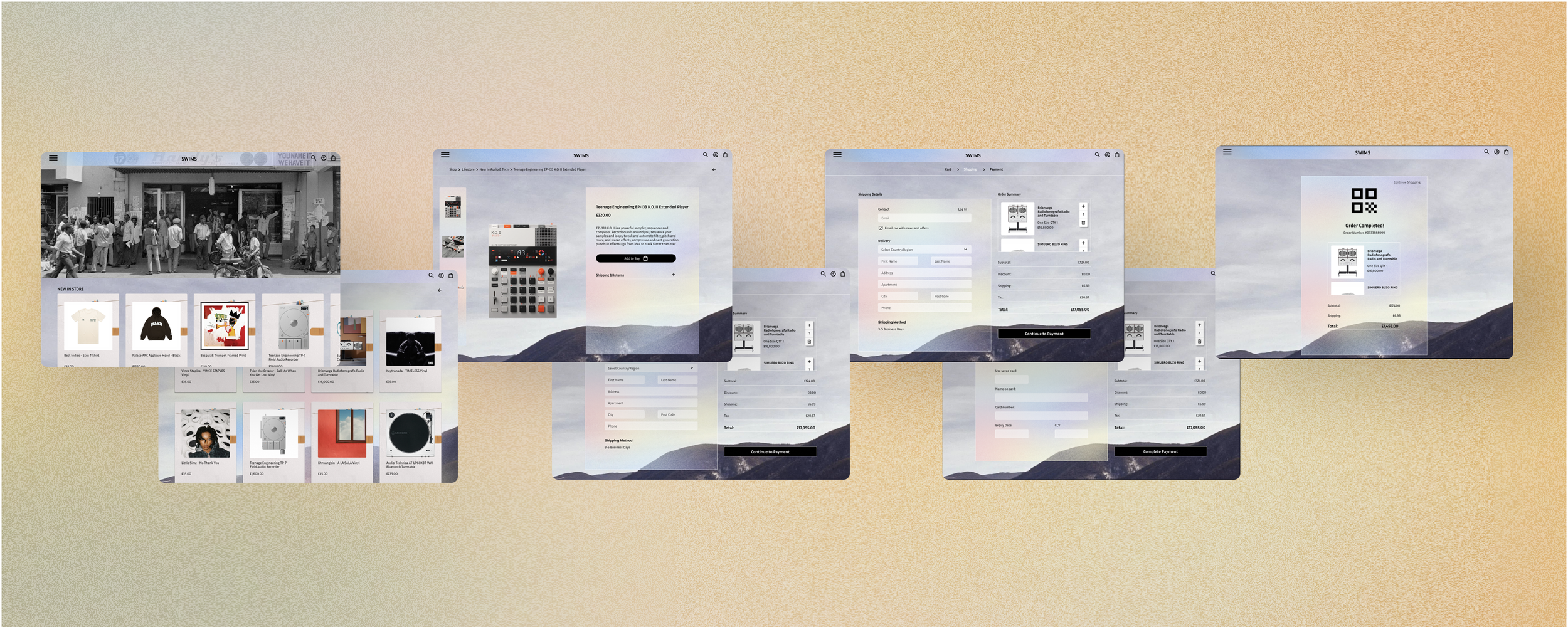
High Fidelity Desktop Prototypes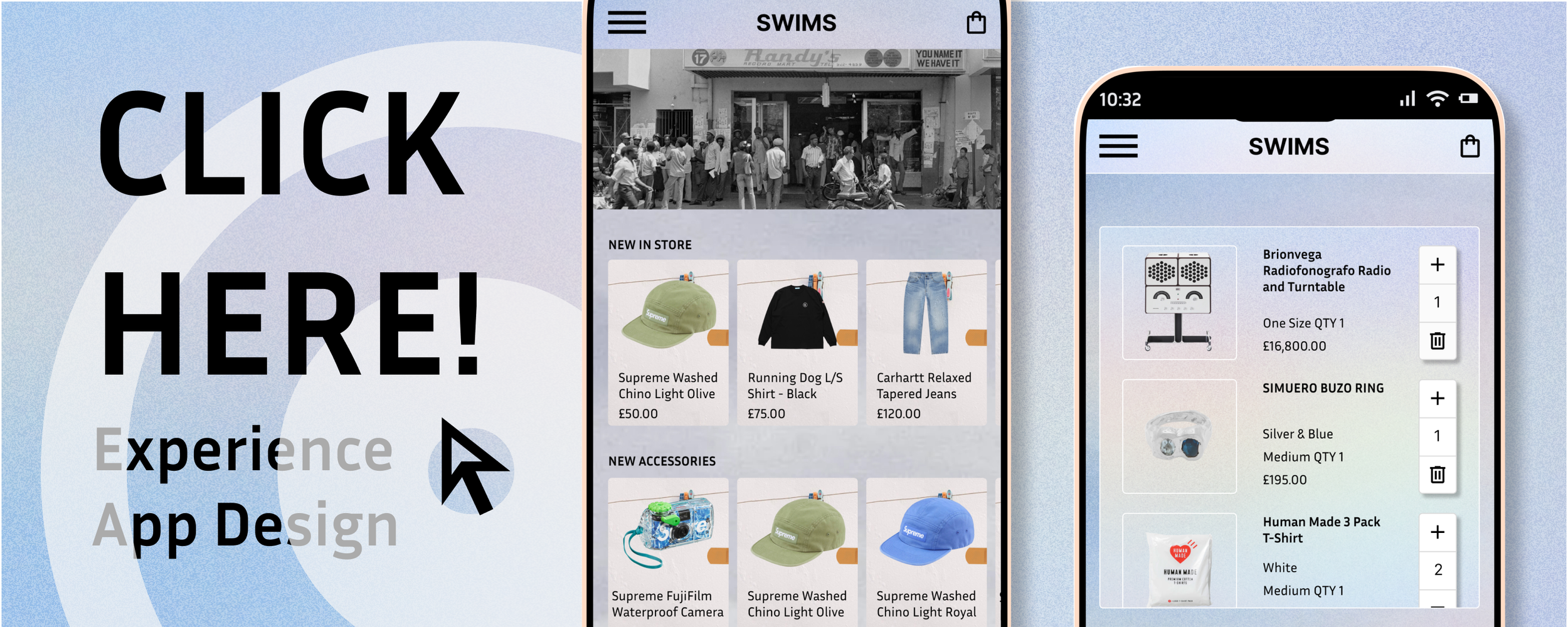
Other Case Studies
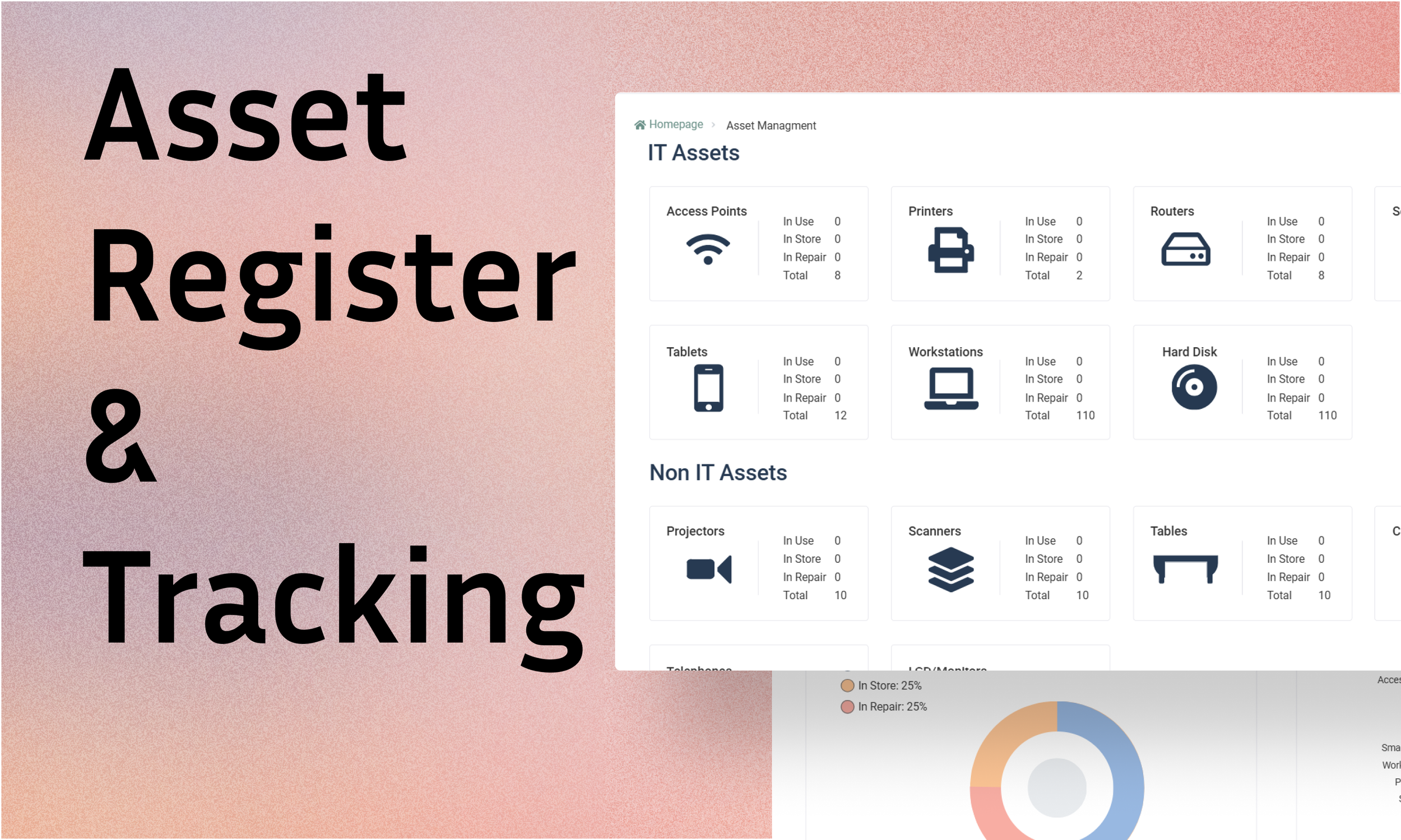