Role:
Brand, UX, UI, design system, content
Type:
Self-directed product + brand
Status:
Hi-fi built · testing next
Figma - full design system, 5 stages, desktop and mobile, prototyping & campaign and product assets
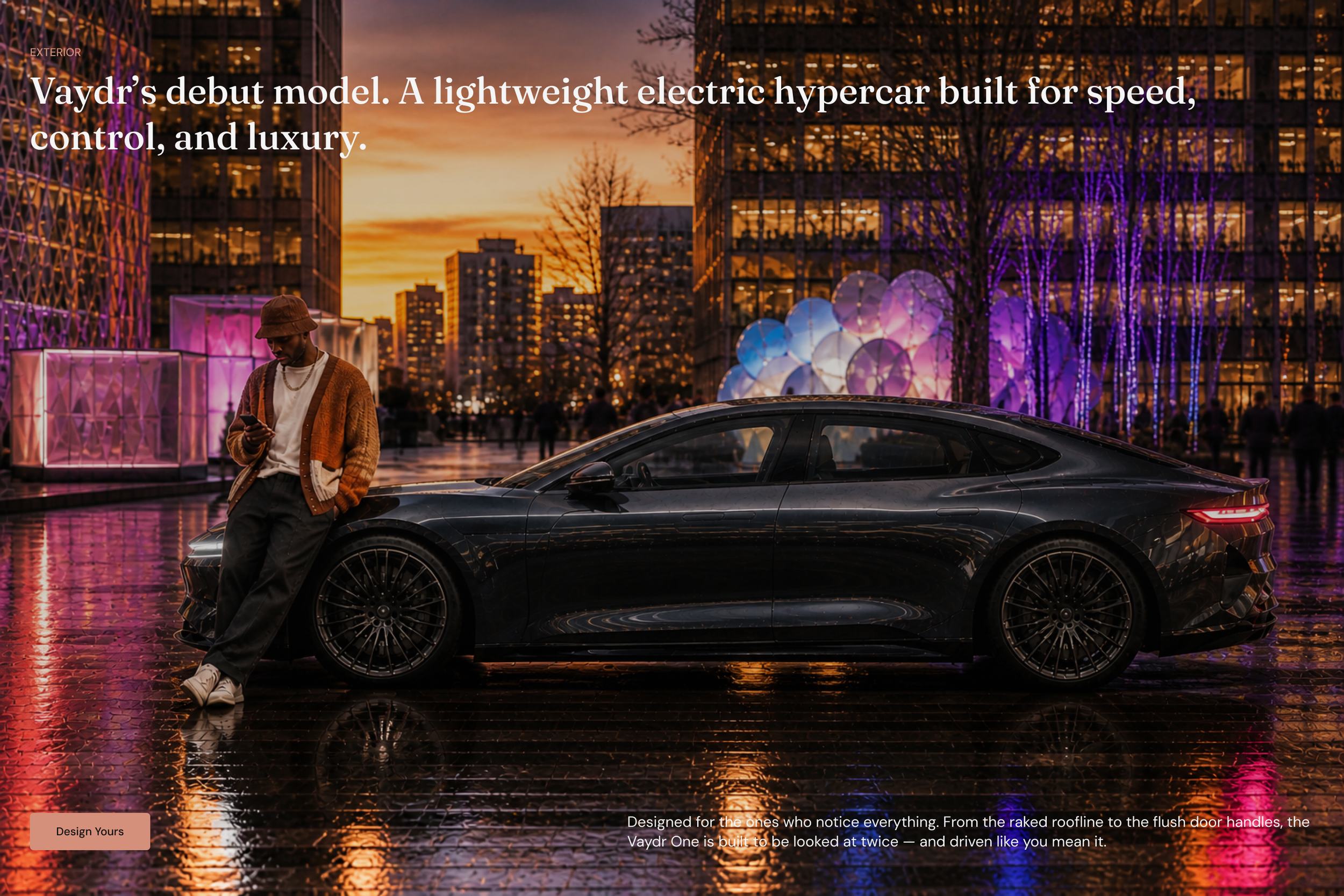
Design-conscious buyers going electric
01.
THE CUSTOMER
Buyers in the consideration phase. They are comparing models, want to understand what separates one variant from another without dealer pressure, and want a low-commitment way to actually get behind the wheel.
They find legacy automotive sites either overwhelming (configurators that demand decisions too early) or thin on the design and brand cues that matter to them. Vaydr is positioned as the design-first challenger for that buyer: clarity over clutter, confidence over hard sell.
The decision and the action were tangled
02.
THE INSIGHT
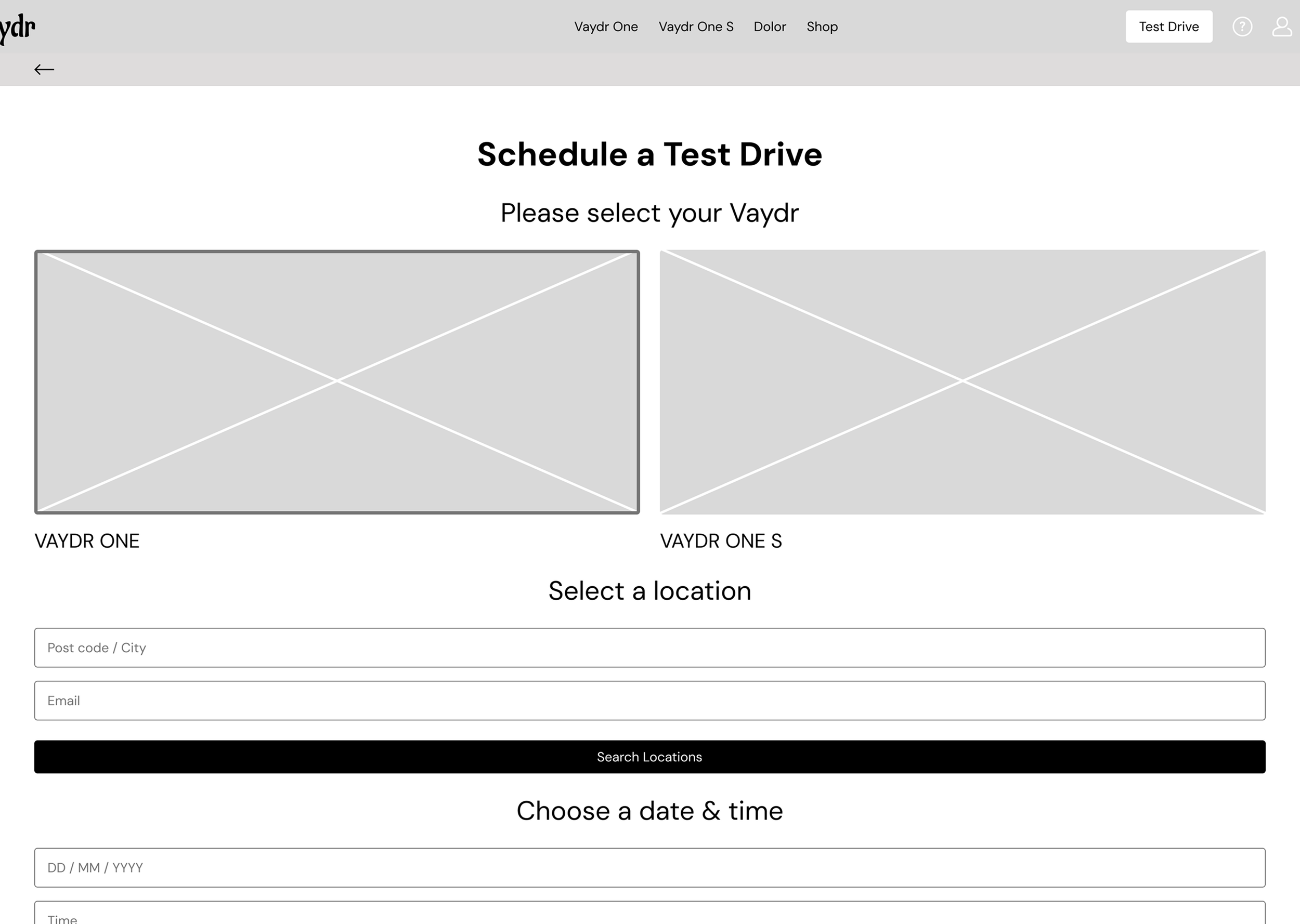
Low-fidelity usability testing surfaced the core problem: people could not confidently tell the three variants apart, and that uncertainty stalled them before they would book a demo drive.
The decision ("which Vaydr is for me?") and the action ("book a drive") were knotted together, so users hesitated on both.
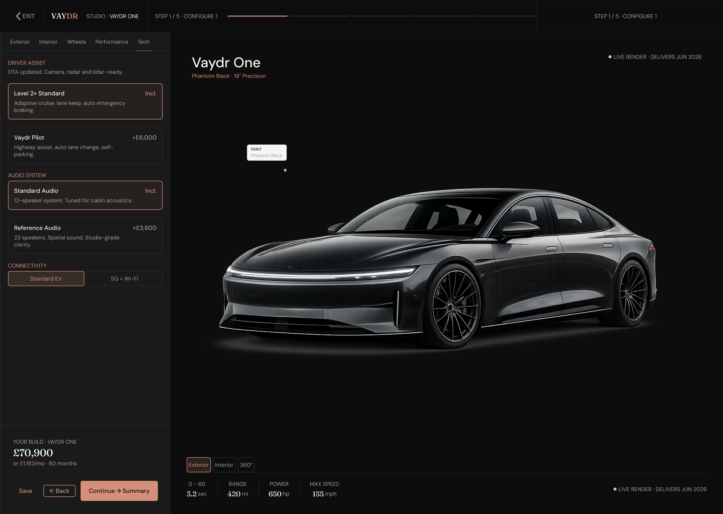
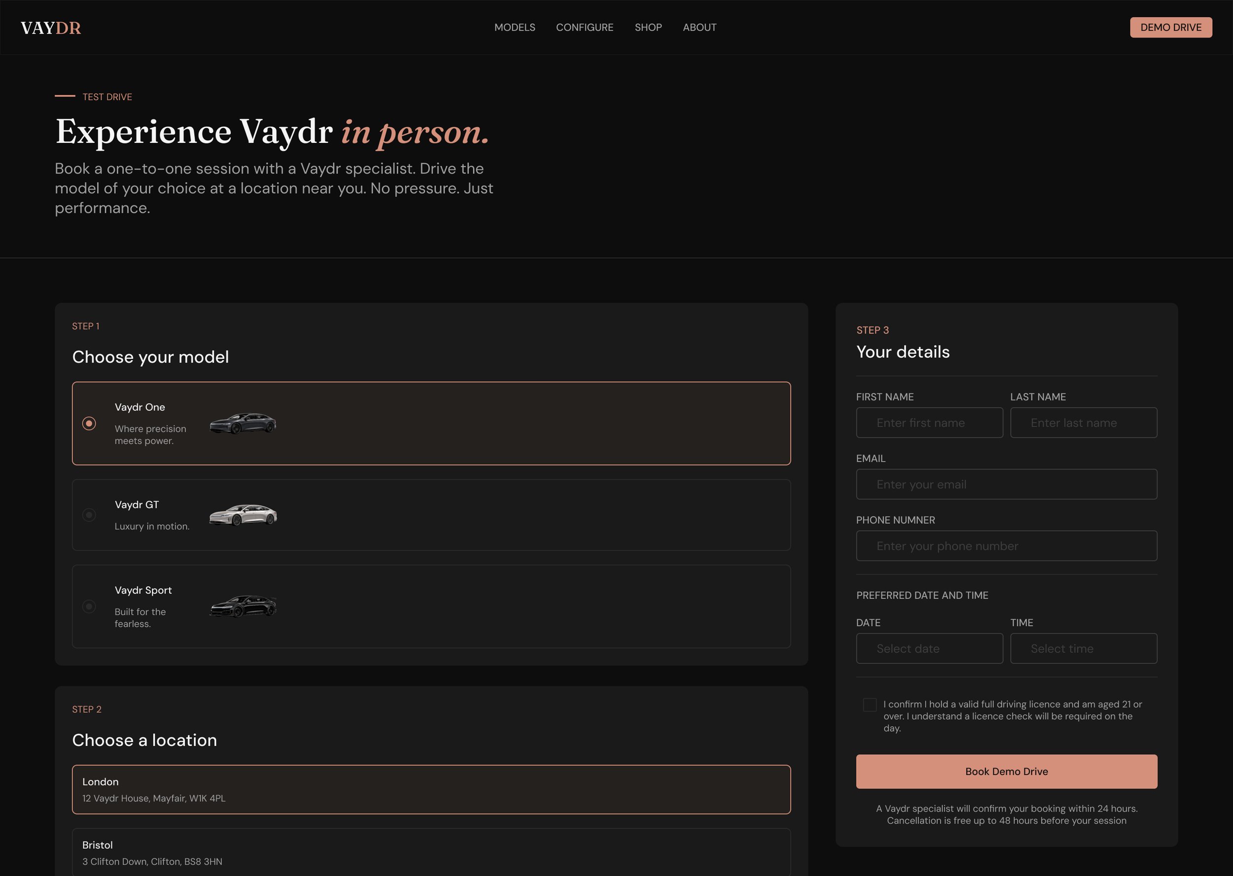
Decouple the booking from the configurator
03.
THE A-HA MOMENT
The fix was to separate the two. Let people book a demo drive early as a low-commitment entry point, and turn variant selection into a guided, side-by-side comparison rather than a configurator gate.
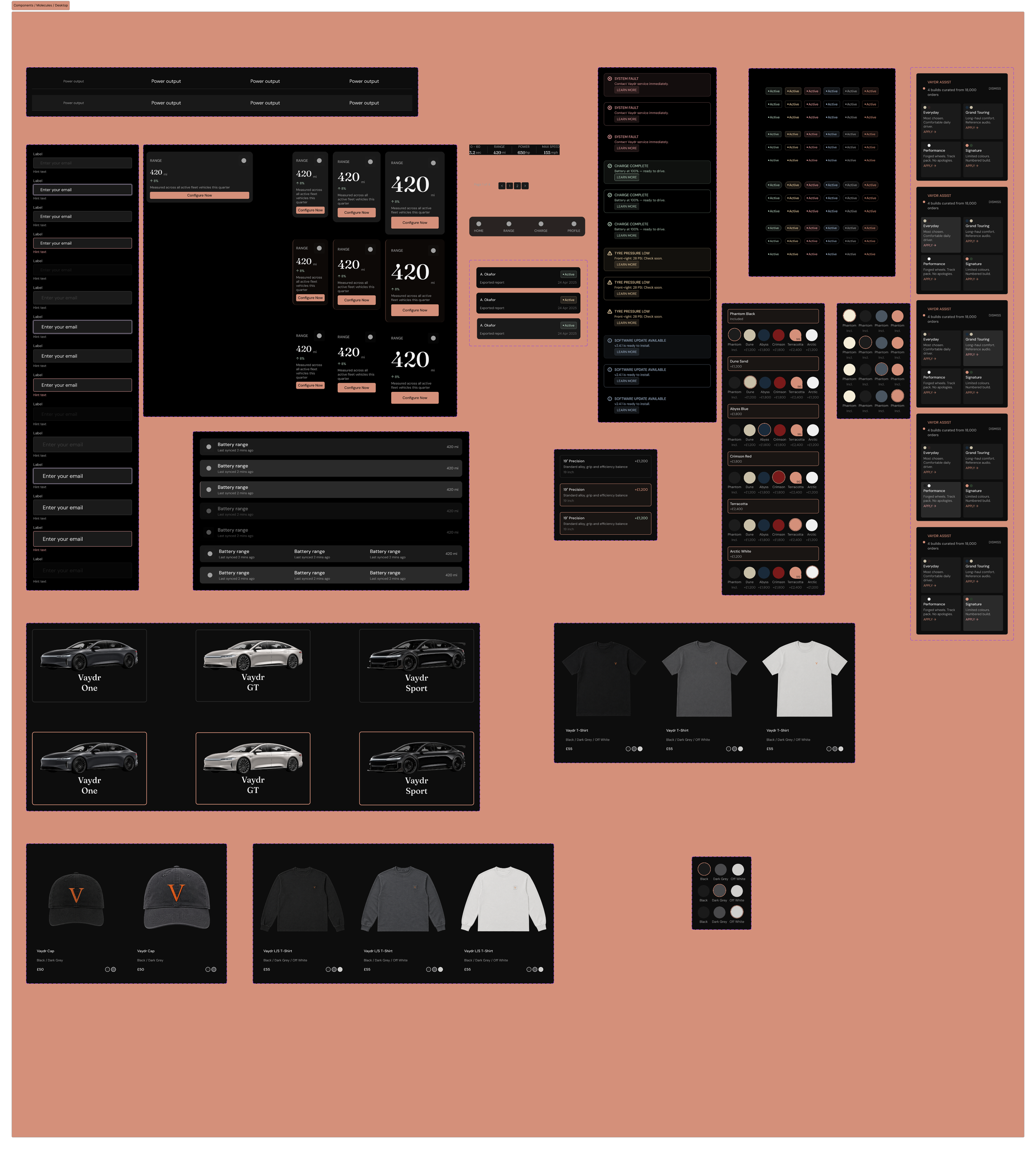
The second realisation was bigger: Vaydr was never a set of pages, it was a system. One set of tokens and components could carry brand, marketing site, booking flow, and merch with full consistency. That reframing set the direction for everything after.

Coherence at scale, solo, without a user base
04.
THE CHALLENGE
Holding quality and consistency across a system that grew to five stages, desktop and mobile, brand through to merch, as a solo designer. Scope kept expanding, and every new surface risked drifting from the last.
The second challenge was validating decisions without a real user base, which I addressed by running structured usability testing on the prototypes rather than designing on instinct.

A coherent, testable whole
05.
RESOLUTION & OUTPUT
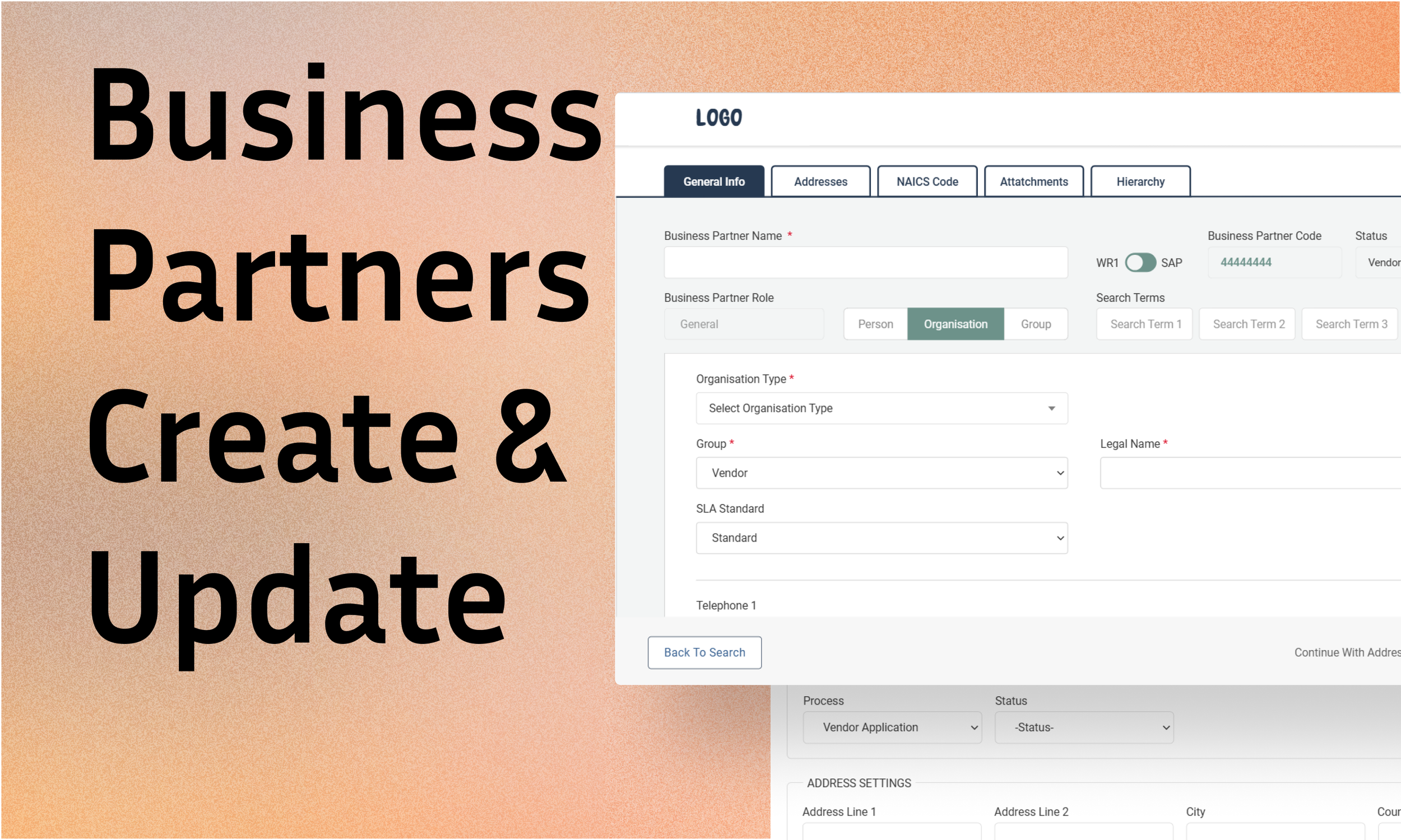
Design System
Complete Figma system, five stages, desktop and mobile, foundations through to assembled screens.
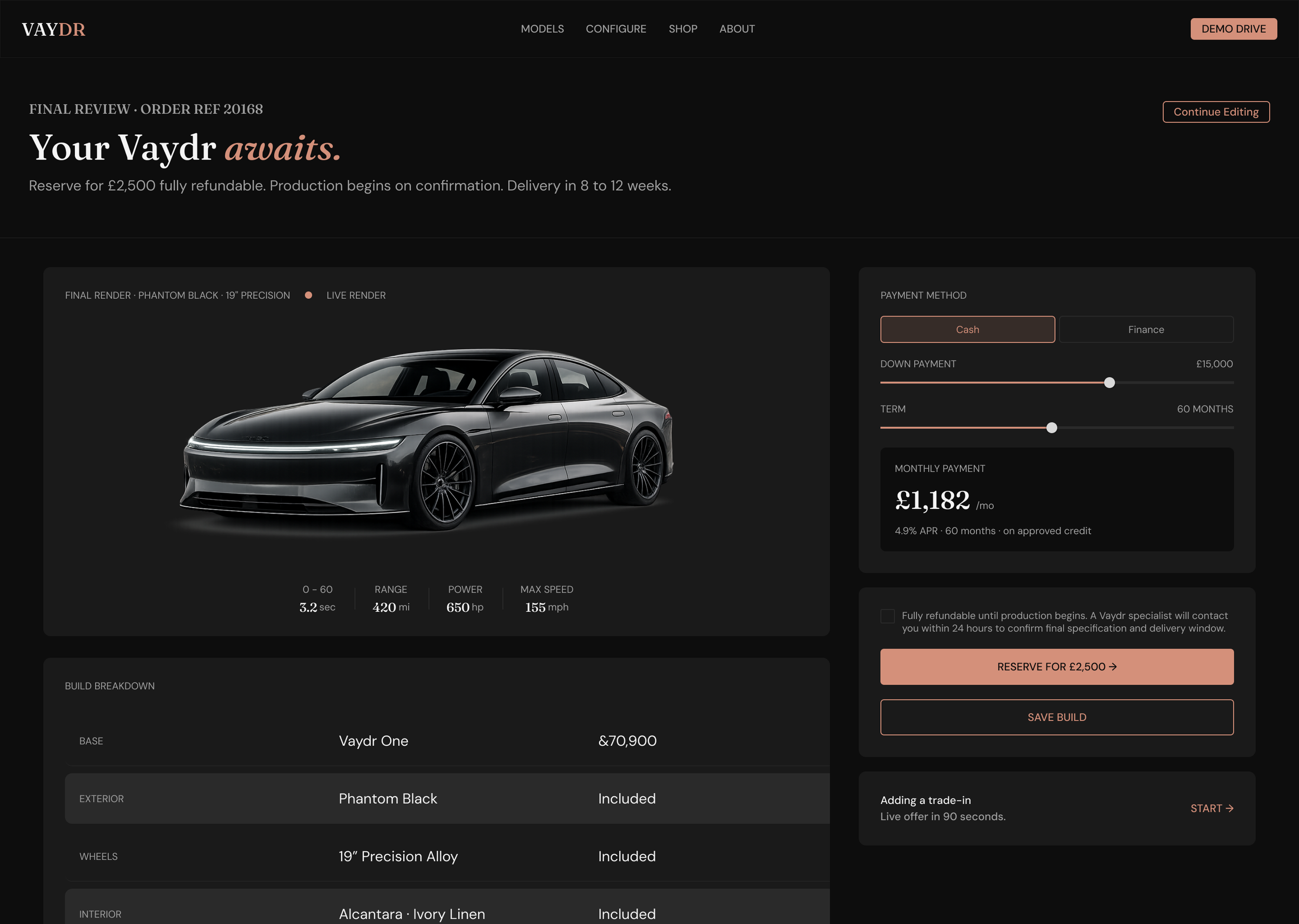
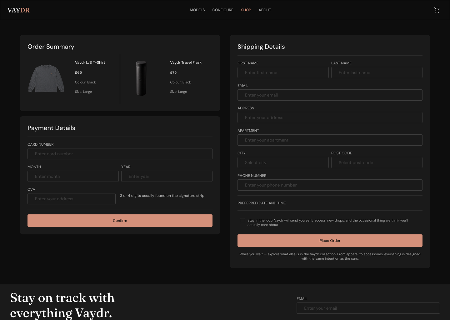
Booking flow
A validated demo drive flow, reshaped directly from low-fi findings.
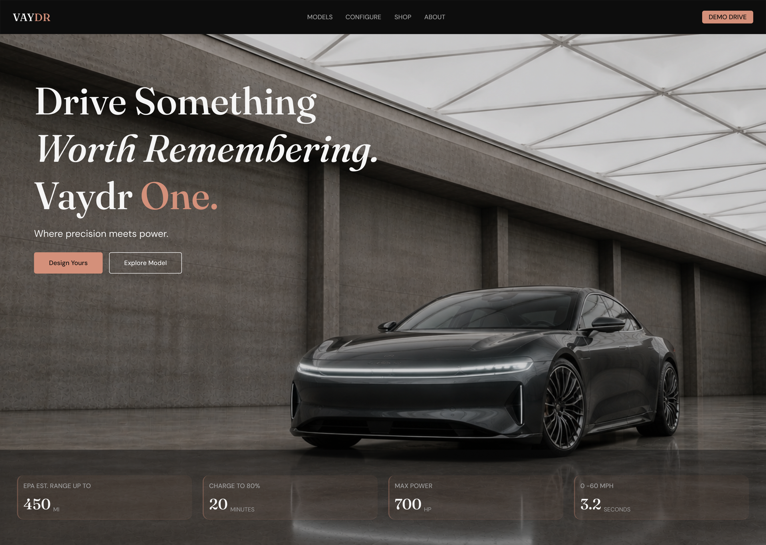
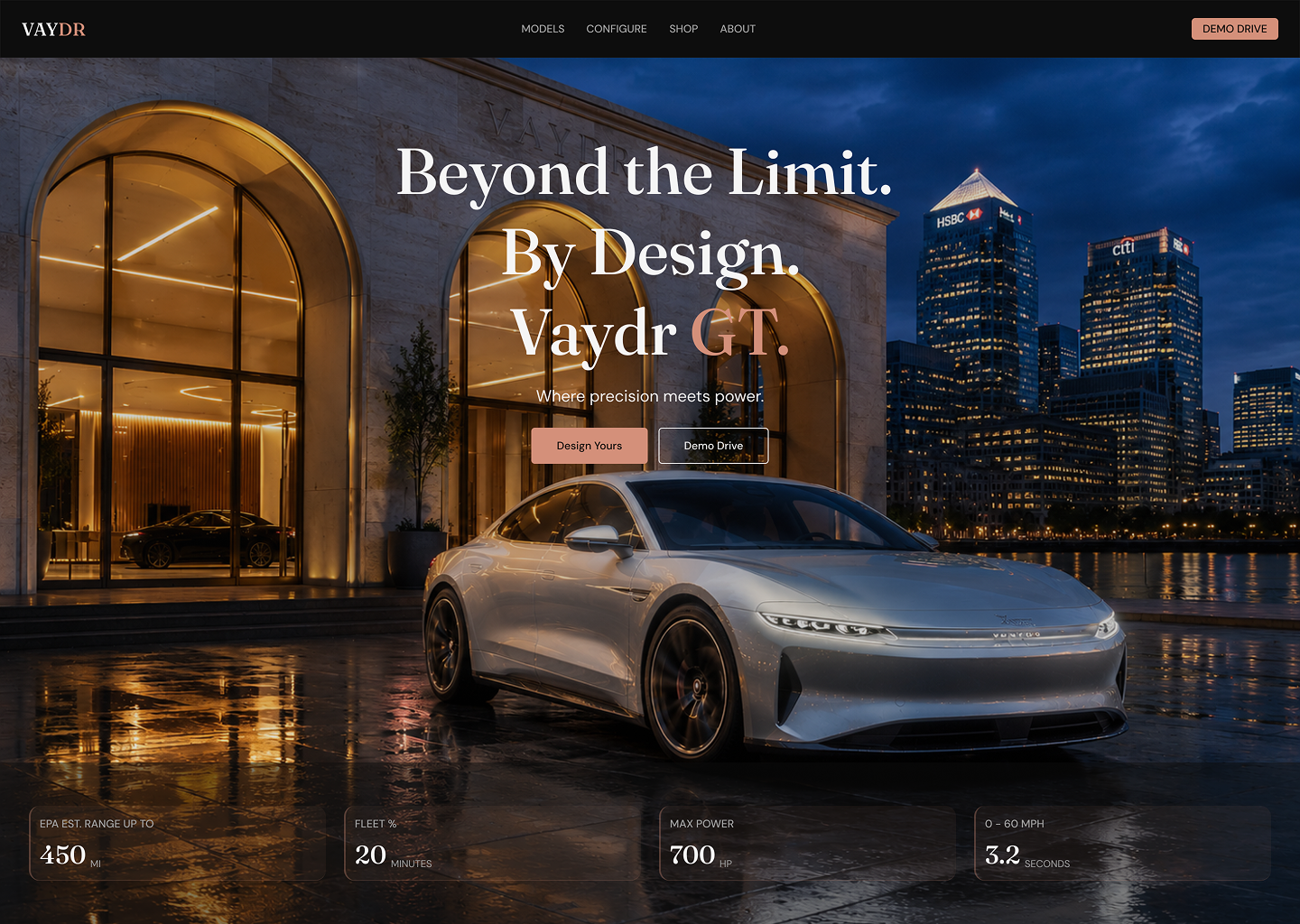
Variant pages
One, GT, and Sport, built around legible, side-by-side comparison.
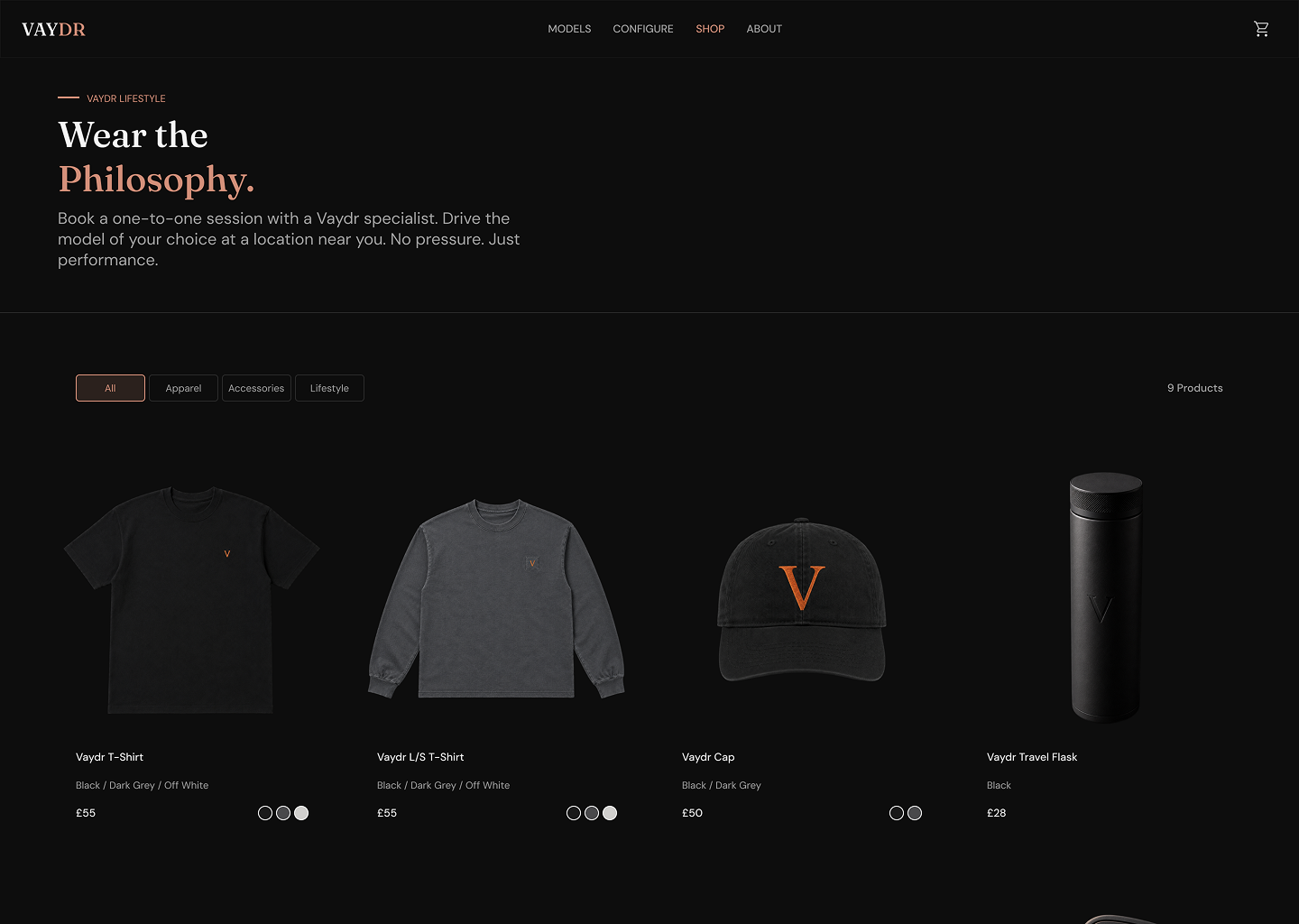
Marketing & Merch
Marketing site and merch shop carried on the same system.
Imagery
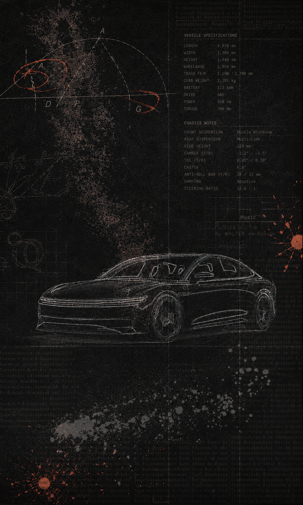
AI-generated product imagery with Photoshop touch ups.
Next steps / what I'd validate
IN PROGRESS
The high-fidelity designs are built and the next iteration is a planned round of usability testing. I’m naming this deliberately. Testing as an ongoing discipline rather than a box ticked once.
Does decoupling booking from configuration reduce drop-off?
The central hypothesis from low-fi, now testable on the hi-fi flow.
Is variant differentiation legible?
Whether side-by-side comparison resolves the original confusion between One, GT, and Sport.
Does mobile booking hold up?
Whether the flow completes on the smaller breakpoint, where commitment friction tends to spike.
How I'll measure it: task completion rate and time-to-book, points of hesitation or error in the booking flow, and a SUS score benchmarked against the low-fi baseline. Findings will feed a final revision of the system.
Other Case Studies